Tic Tac
Brand refresh proposal drawing heavily on Tic Tac's 60s heritage, emphasizing the product's unique selling proposition and aiming to differentiate the brand from the rest of the category. Student work.

The brand was brought to the US from Italy in 1969 and has been a leading mint brand ever since. Sleek and bold, but playful and whimsical, Tic Tacs have an almost undefinable modern appeal. The name Tic Tac comes from the click-clack sound of the mass of distinctive, tiny, pill-like pods in the compact, chic, plastic-fantastic, travel-friendly container.

Tic Tac surveyed over 10,000 customers over an 18 month period to find out what they liked about the product. The results:

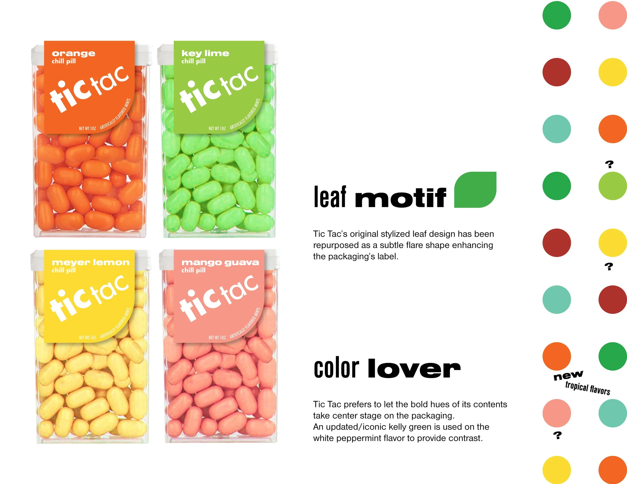
An updated logo and modern/vintage type treatments, repurposing the iconic flare shape in the packaging’s label, and proposed extension of the brand’s popular orange flavor (a natural breath freshener!)

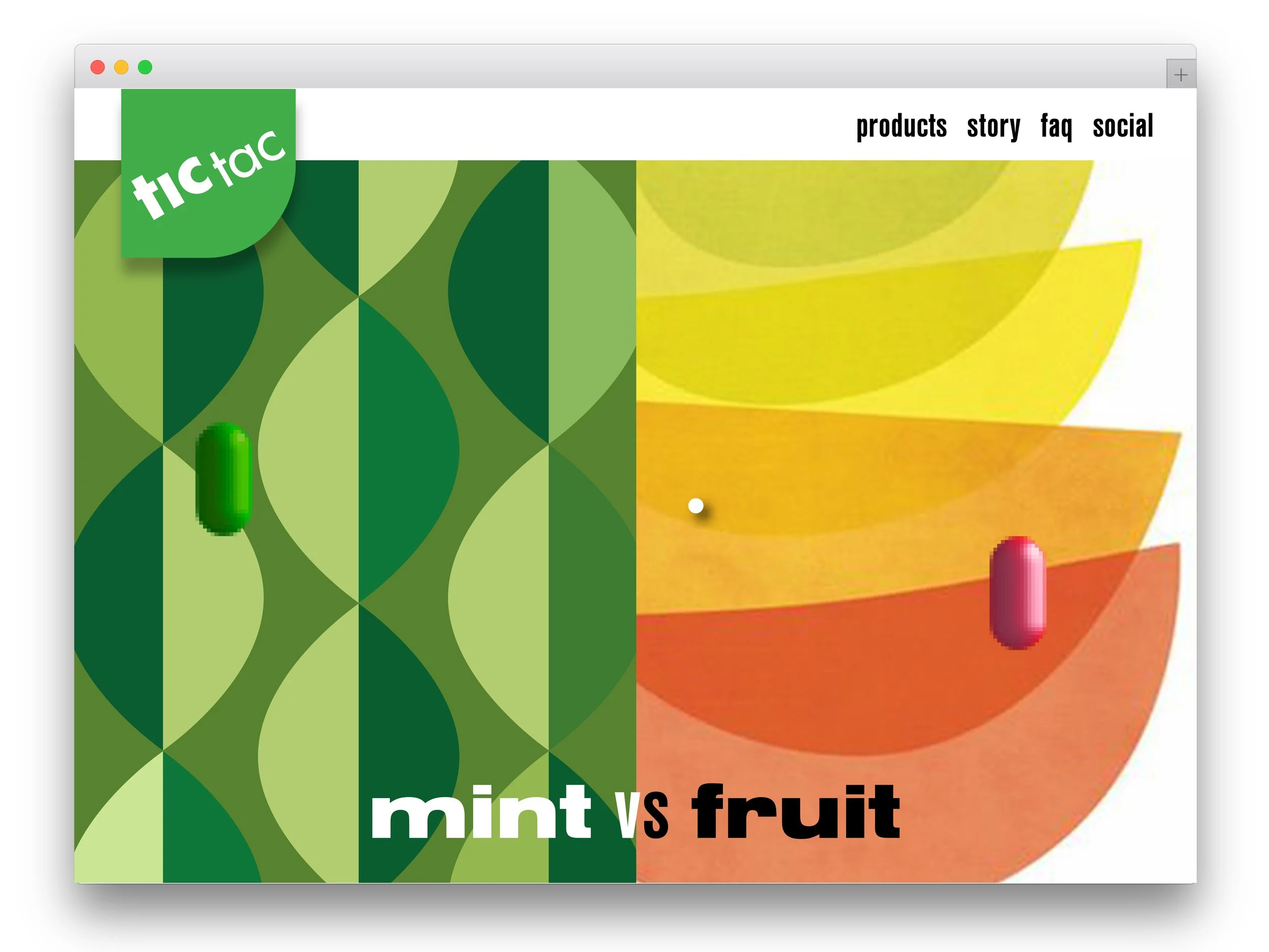
Web-hosted retro-inspired arcade games combine the brand’s vintage appeal with the customer’s need for ‘a moment of relaxation.


Social graphics play off the idea of coolness - both the ‘cool minty fresh breath’ of the product benefit and the almost undefinable appeal of the unique product - the cool factor.